26 September, 2012

Review: Love Puppets #s 2 & 3.

Love Puppets #s 2 & 3. 
Jessica McLeod and Edward J. Grug III. 
Monster Robot Industries, 2008 and 2009, 24pp each, A5, about $5 each.  
http://www.etsy.com/listing/27943488/love-puppets-3-pack-with-badges
http://www.webcomicsnation.com/jessica/
http://www.webcomicsnation.com/grug/

Although I'm reviewing both of these issues at the one time, they are a little different from each other. Love Puppets #2 and #3 don't feature the same characters or storyline, but they are both created by McLeod & Grug, and they both inhabit the same world — a world where everybody are puppets. That's the interesting and catchy thing about this series: all the characters are some sort of puppet; a glove puppet, a string puppet, a full-costume puppet, etc., but definitely a puppet. Why is that? No reason I suppose. A stylistic choice would be my guess, just as some people draw comics where all the characters are animals for no reason other than stylistic choice. I suppose there's also the possibility of a shortcut to character and personality through the type/look of puppet. Or maybe the 'G' simply fell off the term 'Glove Puppets'? It definitely makes the whole thing a heck of a lot cuter! And boy, is it cute! 

Issue 2 is a lovely tale that takes place in the same café as issue 1 did (if I remember correctly), and concerns the boss, a book signing, and food. To say any more would probably give too much away because, although these comics are about 24 pages long each, they're definitely quick reads, which, as well as being light and airy, are quite linear and to the point plot-wise. This is not a complaint, it's storytelling that's well suited here, successfully getting the single-issue tale satisfyingly told. To be honest, my memory of finishing issue 1 was that it looked like I was in for a continuing soap opera style storyline, and I'm pleasantly surprised that it's not the case; I'd much rather see what other inhabitants of the Love Puppets world are also up to. 

While issue 2 is quite cute and quaint, issue 3 has a slightly darker tone to it. I really hesitate to use the word "darker" at all because really there's almost nothing in these comics that could be called dark in any way, they're so lovely. Issue 3 however does feature a character who's quite distasteful and a sexual opportunist, which puts more of an anxious edge to the general feeling of the issue.

The art in both is bold and cartoony, with an unlaboured mono-weight pen line throughout, sometimes with a thicker line for emphasis or to make a character stand out from the background. The layouts are all clear and usually easy to read. It's all very unpretentious and honest with not a ruled line or computer typeface in sight, which helps add to its likeable indy flavour. 

For a bunch of "puppets", there's an awful lot of emoting and acting on each page. A lot of this is due to pacing and layout, with a fearless use of silent panels at the right times and places. A lot of it is also due to nice character work and acting in the drawing. It may be simplistic in style, but I think deceptively so, with so much information, both plot and emotion, being communicated very directly. There are a few times where the draftsmanship looked a little on the clumsy side for my liking, but I'm sure that would once again be chalked up to the indy style of the work, and I only noted it in a panel here or there. 

Between the two of them, issue 2 was my favourite, if only because of the lovely way the story unfolds – cockle-warming, if you know what I mean. That being said, it's certainly not as if issue 3 is a disappointment in any way, just a different story with a different set-up.  

The cute style, idiosyncratic story telling, and the effortless way the puppet characters are made believable make these books worth your while picking up or ordering from the creators. I enjoyed them and so did my (then) 11 year old daughter. Make sure you get number 1 while you're at it too.

16 September, 2012

What I Watched Last Month…

What I watched last… 
March 2012


John Carter. (at the movies)
As I feared, this was disappointing.
Unsurprisingly, considering I've read the book, my biggest problem was the sweeping changes made to the story and characterisation, and the mind-boggling additional elements that in my opinion were not only unnecessary, but also contributed to complicating what is already quite a wide ranging story with a very large cast of characters.
There were some really great bits, but they were in low supply and quick to pass. It certainly looked good as far as production design goes and I honestly forgot for most of the time that the CG characters and other elements were in fact CG.
This should have been epic, raw, bold and savage, but we only got glimpses of that. The book was written by an untested amateur, while this movie was made by a seasoned professional, but I have to say the book was better.

12 September, 2012

Supanova Sydney 2012

I thought I'd post a few pictures from last June's Sydney Supanova which marked the 10th anniversary of the event in the city where it all started. 

It was a great weekend, with our biggest turnout ever! As such, it was a pretty busy weekend for me and I didn't get to take many photos during opening hours, but I'll share a few that I do have. 

How busy was it..?
The Artists' Ally list was the longest at Supanova ever.
The exhibitor list was the longest at Supanova ever.
The Supa-Star guest list was the longest at Supanova ever.
Sunday was the biggest Supanova Sunday ever.
Saturday was the biggest Supanova DAY ever.
The weekend was the biggest Supanova ever, with 28,400 fans, nerds, geeks, collectors and aficionados in attendance! 

It was awesome.

Full disclosure: I'm one of the founders of Supanova, art direct it, and have a financial stake in the business. 


 Friday night, and it all begins…

 Friday night is Preview Night for weekend pass holders, and at the Opening Ceremony there was a rousing chorus of 'Happy Birthday' in honour of Supanova's 1oth anniversary. 
Many of our guests were on stage there, and so was Supanova Actual Daniel Zachariou. 

Friday night also saw a comic book masterclass given to an attentive audience by the erudite and articulate, as well as incredibly talented, David Mack.

Saturday morning found Sydney under a slightly drizzly sky, and so Supanova allowed the masses of crowds to wait in a 'holding bay' instead of outside in the rain. I stitched three photos together to show the enormity of the numbers. Can you count all the Pikachu onesies?!?

We had some wonderful comic book guests. In these two shots, from left to right, there's Kara and Tony Moore, Jim Cheung, David Mack and Nicola Scott

Speaking of comic book artists, Artists' Alley was huge. Here's a shot of one of the three packed AAs.

 Three photos stitched together for this panoramic view of the exhibitor floor. 

 Some of the wonderful crowd. 

And some more. 


 While an enormous and enthusiastic audience listened to Christopher (Back to the Future, Addams Family, Who Framed Roger Rabbit?) Lloyd

  …my daughter was lucky enough to hang out with the lovely Hex (Stephanie Bendixsen) from Good Game!

Thanks for turning on the beautiful Sydney weather for Sunday, Olympic Park! 
See ya next year! 

03 September, 2012

What I Read Last Month…

What I read in… 
March 2012
Guh #s 1-5, by Jase Harper.
I bought the full collection of Guh from Jase Harper's Etsy store and I urge you to do the same. 
Full review coming soon. 


The Deep: Here Be Dragons, by Tom Taylor and James Brouwer.
A fabulous fun adventure comic for all ages. 
Full review is on it's way. 


Prophet #22, by Brandon Graham and Simon Roy, Fil Barlow.
I bought this primarily to read the Fil Barlow back-up story, but I've heard so many good things about the series that I was equally as curious about the main story, especially considering this is a single issue in an on-going storyline. 
It's quite the interesting sci-fi tale, or a chapter thereof. Even with no knowledge of what it was all about going in I really enjoyed my time here. There's a strong European sensibility to this, both art and story, and enough quirky and interesting things happening, told in such a way as to not spoon feed but also to not be impenetrable, that it's made me likely to pick up a trade paperback sooner or later. 
The Barlow short story lived up to my high expectations. Witty and weird, delving once again into his ongoing Zooniverse oeuvre, presenting us with another Zoon cultural oddity, its hang-ups and foibles, while simultaneously having a satirical dig at our own western culture. Brilliant cartooning in this a welcome return of the Zooniverse and I'm super keen to see the upcoming stories Barlow has promised. 


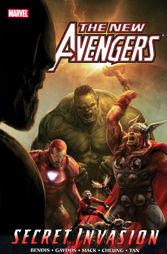
New Avengers Vol. 8: Secret Invasion Book 1, by various.
I really don't know how anybody reads these sort of comics on a month-to-month basis. Some of the chapters in this book — each chapter being an issue of the monthly comic — give so little story it's almost criminal. Then there are other chapters that cover years and years worth of plot and backstory, but in such a matter of fact and flat fashion as to totally rob the telling of any sense of awe or scope regardless of it's star-spanning repercussions. 
I would much rather see all these brutally separated sections of such a large story woven into the over arching plot as simultaneous threads and subplots. 
The brightest part of this volume for me is the clear, clean, enjoyably traditional art of Jim Cheung. Even though I can see so many of his influences hardly disguised by being barely integrated into his own style, he tells the story solidly and with flair. The other art present is not bad by any standard, and every chapter has an artist whose style is more or less appropriate for it, but they're not my cup of tea for the most part. 
I had supposed reading this single volume would give me a nice chunky read, and instead I feel like I got a bunch of disconnected episodes or vignettes, all too fleetingly burned through. 

29 August, 2012

Progress Report 002

Just a real quick progress report update. The picture below has two scripts: Greener Pastures: The End draft one on the left, and the newly minted draft two on the right. There's still things to do on the raw script, but with draft two now written I'm going to start thumbnailing this bugger. The work on the script and story from this point on will have a lot to do with how things are visually hitting the page, how their pacing reads, what their importance in the overall story is, etc. We'll have a much clearer idea of how effective scenes are, both within themselves and in the larger framework once there's a visual working document.


So how big is the story? At last estimate I think we're looking at 270+ comic pages, but let's see what happens when I actually take a crack at the first version of the thumbnails – that could change a lot, in either direction. In any case, I'll start playing with visual motifs and themes, pacing and layout, and probably even start a lot of the new characters' designs in this process. It's daunting and exciting.

By the way, just because I'm calling this version of the script "draft two" doesn't mean that there hasn't already been heaps of work put into it. Michael's been slaving over it to make it as finished as possible before handing it too me, reworking a lot of dialog and having another look at a lot of the scenes. I have to say, even though I've read it a number of times, the final scenes still bring a lump to my throat. 

26 August, 2012

What I Watched Last Month…

What I watched in… 
February 2012

Chronicle. (at the movies) 
I found this to be another really good crack at "what if some people really DID get super powers?" It was a little too slow and long in the take-off, but once it got going it was really engaging. A nice trio of main characters, an interesting and mostly believable exploration of the ramifications of what's happened to them, and a really exciting climax. 
I'm not entirely sold on having the entire movie 'chronicled' through various cameras. I don't know that we necessarily gain anything more from that than if we'd simply had it filmed in a traditional fashion. It's not really until the climax that it even becomes interesting, otherwise it's often just a strained gimmick. In direct comparison to Cloverfield (which Chronicle has a very similar vibe to, and not just because of the handheld camera style) Cloverfield at least had a definite reason for delivering the story to us the way it did, while Chronicle's reasoning is far more flimsy and hard to accept. 
I glibly described Chronicle as 'Cloverfield meets Heroes versus Kick-Ass' and I think that sums it up pretty well. I enjoyed Chronicle an awful lot, see it. 

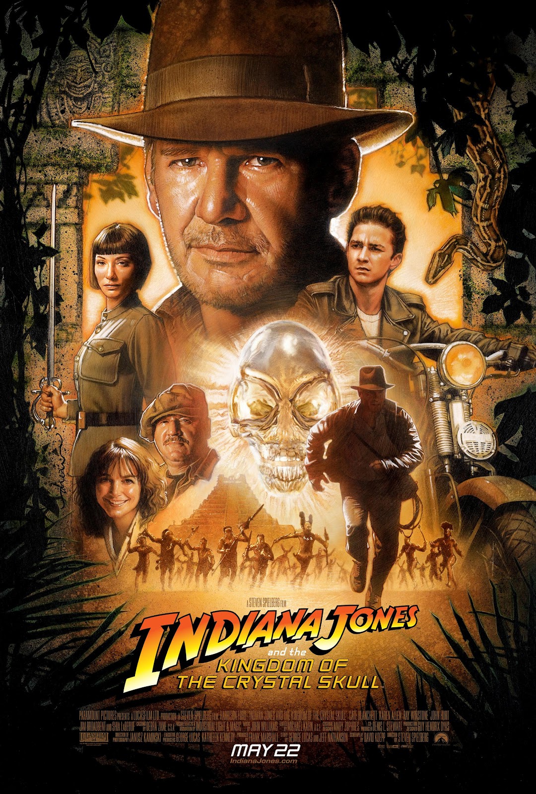
Indiana Jones and the Kingdom of the Crystal Skull. (on DVD)
So I finally got around to the last movie in my Indiana Jones re-viewing. This is not so bad really. Not nearly as bad as I whinged and moaned and lamented upon seeing it in the cinema. Yes, there's some stupidity, and a lot more useless stuff than I'm used to in IJ movies, but for some reason I was able to forgive it more this time. 
The sci-fi angle (aliens, telepathy) was really grating on initial viewing, but it seems quite appropriate for the time period now, as does the swapping of Nazis for Reds as the cookie cutter bad guys with machine guns. 
Indy really seemed in character for most of his screen time, which was nice to see, like an old friend returning. I really liked his briefly outlined history since Indiana Jones and the Last Crusade – being a spy, helping the US government, etc. That, and his ability to really endure a lot of physical punishment, made him extremely reminiscent to me of Will Eisner's original comic book version of The Spirit, post World War II. 
LaBeouf had obviously been studying Ford's acting from the first three IJ movies and was aping that the best he could a lot of the time. He was a lot easier to ignore on this viewing too — he wasn't so annoying. Allen's acting was pretty woeful and vacuous though. The ongoing inclusion of the Mac character was completely perplexing once he had "admitted" to being a double agent — superfluous, confusing and should've been eaten by the ants. There were only a few times computer generated imagery was over used. To be honest, Lucas and Spielberg could be admired for their restraint there. 
Here's an observation apropos of nothing really… The opening scene with the kids in the hot rod near the nuclear bomb test site reminded me very much of the opening scene of The Hulk's origin story from the original comics. And then to see a general named General Ross turn up? Coincidence or homage? 
Lastly, I never had a problem with the fridge. Not originally, and not now. There, I said it. 

23 August, 2012

GP TV. Ep03.

And so we come to the first time the Greener Pastures' creators themselves were ever on television. The funny thing is, it wasn't on Australian TV! 

Michael and I thought we'd go to New Zealand, just for the heck of it, to visit their annual comic convention at the time: IcoNZ. It was July 1995 and this was their second of three IcoNZs. We weren't the only Aussies there either, Stuart Hale also made the trip representing Issue One Comics . 

One of my favourite sales techniques when interested punters asked if we were New Zealanders was to say "Yep! We're from the West Island!" which would usually take a moment, and a double-take, for the penny to drop. At one point I looked up to see Neil (Split Enz, Crowded House) Finn browsing through our work. He bought a copy of Greener Pastures and as he walked away I sheepishly said "You can write a song about it if you like…" I don't think he ever did. 

We had a great time and met some lovely people. 

I don't know exactly what television show this report appeared on, I assume it's the news or a magazine style show. Neither do I know exactly what night, but I assume it would be 1st or 2nd of July 1995, as that was the date of IcoNZ 2. After the inane chatter about trading cards, sporting memorabilia, and the fake Baywatch girl, they talk to some local NZ comic creators and Michael and me. 


Cartoonists interviewed: 
Craig Petersen 
Wade Shotter
Cornelius Stone
Tim McEwen
Stuart Hale
Michael Michalandos

Cartoonists work also shown: 
Matt Hatton
Ant Larcombe
Ant Sang
Sam Young
Paul Newell
Jason Paulos
There are also a few incidences where there is work that I'm not able to easily identify. My apologies. I am pretty sure there's a flash of Roger Langridge though.

Aired July 1995. 

20 August, 2012

What I Read Last Month…

This is what I read in… 
February 2012


Phatsville #16, by various.

The latest issue (at the time) from these amazing stalwarts of Australian underground comics (if such a thing really exists anymore). If you're familiar with Phatsville, then you know what to expect, and you're in for more of the A-Grade same. If you're not familiar, let me tell you you're in for a healthy dose of ugly, smelly sex & drugs & poo & dicks, all with a cheeky Aussie wink. 
This issue leans heavily on the two longest contributing citizens of Phatsville, John Stewart and Giles Kilham, which is great, and their true-life adventures in America when they attended San Diego Comic Con, which are really funny. J-Stew and G-Man are truly the spirit of this book, and it's definitely them and their cartooning and writing that I'm thinking of when I say 'Australian underground comics'. 


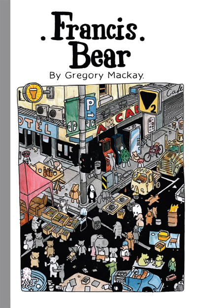
Francis Bear, by Gregory MacKay.

This is a, dare I say it, whimsical collection of stories starring the titular bear. I hesitate with 'whimsical' really because it shortchanges the heavier, grounded base of most of the book. Despite it being populated with nothing but stuffed animals, this isn't a kids' book. Below that surface style, immediately below, are stories of urban living, cars with no brakes, skin cancer, petrol wars and getting drunk. I don't know that there's necessarily any important statements or observations being made, but the quirky vignettes are obviously drawn from life to some extent, and they're usually quite dryly funny. 
The cartooning style is composed entirely of a line of unwavering weight but always uncertain strength. This (not thin) monotone line only adds to the childrens' story look of the pages, in a Miffy kind of way, and the busy amount of detail in a Where's Wally? kind of way. That busy-ness is never cluttering or confusing though, which is a real skill in itself. 
A book really deserving its international publication. 


All You Bastards Can Go Jump Off a Bridge, by J. Marc Schmidt. 

I was honored by being asked to do an "author's quote", or whatever they're called, for this upcoming book by J Marc Schmidt to be published by Milk Shadow Books. They sent me a digital advance copy and this is what I gave as a quote: 
"Do you like the surreal in your comics? Do you like the non-sequitur? Do you like to see someone having fun over and over as they experiment with the comics medium? Then you'll love this." 
And that just about sums it up. Over 200 pages' worth of J Marc's simple, mono-line-weight cartooning, in which there's obvious improvement as the book goes on. It's not for the easily offended, there's nudity and sex and (oh no!) dangerous thinking in these mostly satirical pieces. 


The Soldier Legacy #s 2 and 3, by Paul Mason.

Paul Mason's quasi-super-hero comic feels like a quaint kind of throwback to a style of comic Marvel used to make in the 70s. 
The art style is an interesting pairing of a less realistic, more cartoony type of drawing than you might expect from the genre (super-heroic action, both urban and set in World War II), but it works a treat, I think mostly because it stops it from taking itself that little bit too seriously. It's certainly over-the-top in regards to dynamic action and figure posing, as it should be. Mason, the lone creator of the series, still has a little way to go to be 100% professional in ability, but not too far. As he stands now though, it's certainly not a deal-breaker at all. 
Quite the enjoyable genre read! 


Kinds of Blue, by various.

This is a fine 84 page anthology with great heart for a great cause. That cause being letting the reader have a bit of an insight into what it's like to be on the bad side of depression. 
KoB suffers a little of what I feared it might: contributions from artists who are not primarily comic book creators, but not nearly as badly as it might have. In fact I was happily quite impressed by the showing of most of these first-timers. The stories don't suffer from repetition either, which was a another fear of mine given that most of the stories are written by the driving force behind the project, Karen Beilhartz. The fact that there's such a diversity of art style helps in that regard too. 
It's a handsome package, well presented in full colour, and is worth your consideration. 


Clubhouse Comics #1, by various.

What a really fine publication of an Aussie kids anthology comic. Some fun short stories with really good art and lovely colouring. A really good range of differing styles of quality story and cartooning too. Hopefully a sign of more really good things to come from Monster Comics. By the way, full disclosure, I happily had a short story included here myself. 


Astonishing X-Men #43, by various. 

I read so little American super-hero work now, and even less in the monthly "floppy" format, but this issue of Astonishing X-Men was drawn by Australian David Yardin, who in my opinion doesn't draw nearly enough interiors, though is doing a fabulous job as a cover artist. He does a super job here too, both pencilling and inking in his realistic superhero style. 
This issue reminded me how much I do enjoy a good, short, self-contained super story. It was fun, direct, had plenty of character moments, used action as a backdrop to dialogue, intertwined new lore with old cannon, and had a nice serve of suitably ridiculous super-hijinks. Regardless of the fact that of the three heroes, one was a character I'd never met before, and one I barely knew, I never felt out of my depth or lost. And to be honest, I got the kind of buzz only a fanboy of my kind of vintage can get when I recognised that the villain was from a (favourite of mine) 80s Captain America comic. A fun, pop read. 


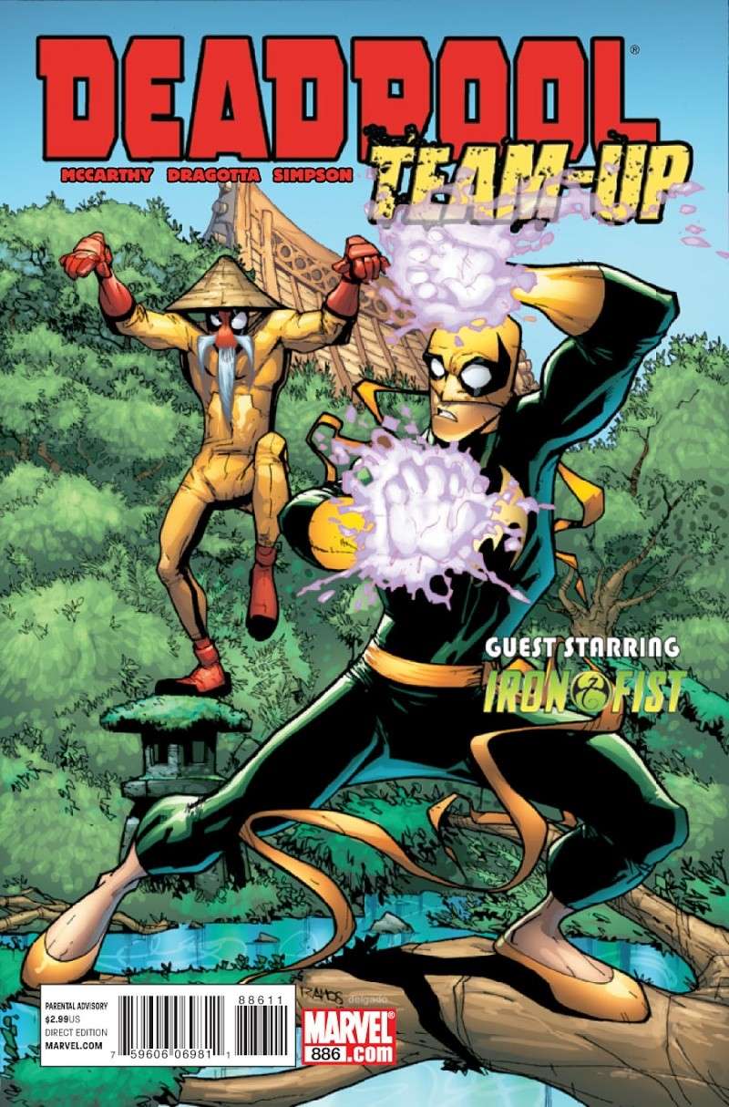
Deadpool Team-Up #886, by various. 

Another monthly floppy bought because of Australian content, this time: Perth writer Shane McCarthy. A throw back to the old time punch-'em-up team-up comics of my youth. Light on anything other than the action and snappy patter, which is par for the course with team-up books of this type, and doubly so for Deadpool I'm lead to believe. Fine fun.  


Deadpool #32, by various. 

One more time, an American superhero floppy bought only because of an Australian's contribution, this time Sheldon Vella. 
I enjoyed this so much that I wrote a complete a stand alone review which is available here


Come Inside My Body — A Choose Your Own Adventure 24 Hour Comic, by Rebecca Clements. 

And that title just about sums it up really! Except for how fun and silly it is, and how wonderfully and whimsically cartooned and written it is. Rebecca's a treasure, and dispite my usual dislike for the publication of 24 Hour Comic Challenge efforts this was a delight to read. 


Mongrel #1, by Bernard Caleo. 

The first issue of Bernard Caleo's new 12 issue project, where the serialisation and the delivery by post are as important, according to Bernard, as the pages themselves. 
It's short at only eight pages, but does the job for setting the scene for the coming story. 
The art is not slick, but it is full of thick brushy verve, with the real strength of Mongrel being in the dialogue, the characters, the philosophy and philosophising. We only get an inkling of all that in this first instalment but it's what I'm looking forward to the most for the rest of the run.  


Blade Kitten volume 1, by Steve Stamatiadis. 

A very smartly produced, 40 page collection of Steve Stamatiadis' web-then-print comic. Although it heavily draws from manga stylings, I don't think this could actually be classed as manga. The art is slick and accomplished, very bouncy and colourful, which completely matches the fun, tongue-in-cheek action/adventure story. 
Quite an enjoyable, poppy ride. 


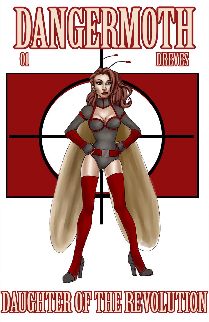
Dangermoth, by Noelle Dreves. 

I picked this up from the artist/writer at a recent Supanova because the art intrigued me. That and the fact it's a female protagonist by a female creator. 
The book's fun and bouncy in theme, style and execution, but still sits on the not quite professional side of the line and not just because of the sketchy style of it, which can be a professionally exercised decision. It's more a seeming lack of experience in the storytelling, slightly awkward figure posing, backgrounds, staging and lettering. The cartooning itself is fine, it's what attracted me in the first place, but application over the long(ish) haul of a complete issue of a comic is where such a thing is truly tested. 
As a first issue it's all set up and origin story, which I understand, but without something more intriguing in a longterm sense, simply presenting the hero's beginning may not have enough to pull me into the next issue. 


Transformers: The Art of Trevor Hutchison, by Trevor Hutchison.

A well deserved reprinting of Trev Hutch's striking and somewhat groundbreaking covers for IDW's Transformers comic All Hail Megatron. The comic was written by Shane McCarthy and he and Hutch are both Perth locals. 
The covers as reproduced here are a refreshing departure from what is normally seen on comic shop shelves, and it seems they draw inspiration from, and successfully evoke the feeling of, war posters and communist propaganda posters, while still being modern and original. 
A nice little collection. 


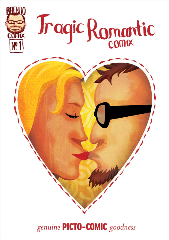
Tragic Romantic Comix, by Brendan Halyday. 

Short and oh-so-sweet romantic daydream by Brendan Halyday. A5 in size with most panels filling the whole page — sometimes the whole spread!, this has thick and jaunty brush work making up most of the art, and interestingly also infusing the lettering. 
A bitter sweet little burst of romance. 


Bad Guy, by various.

This is the first issue of what looks to be a comic attempting a high concept superhero story. 
There's some interesting, stylistic art that thankfully has some personality and that's not just trying to ape the latest Marvel/DC/Image style. Not that it doesn't owe anything to the early Image school of superheroics, but I think it's still trying to find it's feet, especially in layout and staging. 


Dirt Kernel #1, by various. 

Another not quite-professional-standard first ish here as well. Again, full of life and enthusiasm imparted from the team of creators, which if nothing else gives this tale of the only straight cop in a crooked big city police department something to enjoy. 
The art, firmly rooted in manga as style, needs more attention most obviously with the sparse, rushed backgrounds and the lack of originality in style.


Slightly Nervous, by Arran McKenna. 

Normally I'm a sequentials only kind of guy, but Arran McKenna's adorable A6 sketchbook of monsters, weirdoes, 'toons and doodles (in both meanings of the word) is too good not to tell you about. It's a fab collection that showcases quite a range of Azza's styles and subject. 
Grab it if you see it. 


Ben Lives in a Cabin Up a Mountain, Can You Still Get Pregnant If The Dude Just Cries The Whole Time, and It Got Big For No Reason, by Andrew Fulton. 

I received Andrew Fulton's latest three minis in the mail, and they're as wonderfully loopy as ever — loopy stories and loopy limbs. Expect full reviews.