Jill Brett and Greg Holfeld.
Panic Productions.
inforthekrill.blogspot.com.au
www.panicproductions.com.au
This is a really fun and interesting comic. It centres around Max, a haiku writing emperor penguin who smells a rat. Killer whales are making deals with seals; sea life is turning up dead with strange canisters tied to their necks; penguins are being strangled before being eaten; the supply of fish has just run out; and no one's talking. A mystery is afoot, and Max is the only one who can see that it's all somehow related.
In For The Krill is one of those good comics that just doesn't have enough pages. I got to the end of each issue before I realising it, wondering why it was so short, only to find that there was actually over 30 pages of story in each! There's two reasons for this: the style of the story-telling; and it's high quality. This high quality means that "time flies when you're having fun".
The story-telling style is certainly never overly wordy, and often whole scenes – pages worth – are totally wordless. This makes time fly as well since it has a tendency to burn through pages, but it's the brave kind of "let the pictures tell the story" type of story telling that I like. There are plenty of silent "pause" panels, pregnant with acting and meaning, never wasted or useless, but always important steps in the playing of the scene. There's also many scenes of very good dialogue and witty, revealing interplay between characters. These do a great job of naturally presenting character, personality, motivation and the relationships not only between the characters but also to the whole setting and plot, while being entertaining in their own right along the way.
In the first issue we're given large amounts of backstory and character history in very economical and enjoyable ways: some poetry, some action, some banter, some animosity. We learn that the main character is penguina-non-grata, has a penchant for haiku and conspiracy, and regardless of past indiscretions still seems to engender loyalty from at least one friend and a politically/socially powerful ex-girlfriend. That's an awful lot of character info delivered extraordinarily painlessly.
There's a number of times where staging and exposition get downright and wonderfully surreal! There's a sense of theatre (stage and audience) in these particular passages, and a narrator-like soliloquy to their delivery. It's done boldly, with no hint of apology, and as such this reader happily accepts the conceit. I found it refreshing and very agreeable.
The story employs that strange but wonderful type of anthropomorphism that puts the animal characters very much in their natural habitat but also builds in the trappings of human society. For example, they're definitely living on an arctic ice shelf, but they also have an art deco styled bar and night club with the societal customs that go along with it: bouncers, barmen, etc.
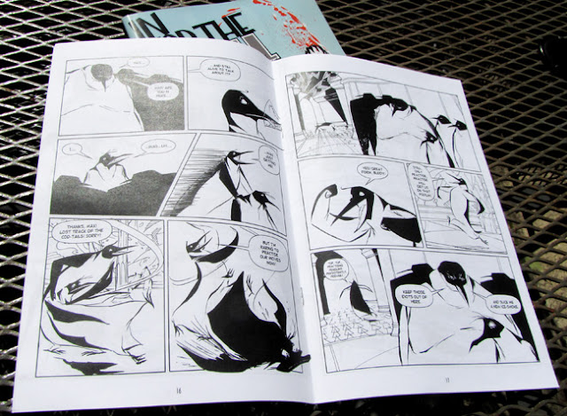
I love the art. The character designs are solid, elegant, dashing and forceful, with plenty of scope for the type of rubbery faces and movement you might see in a Looney Tunes cartoon. Holfeld's animation experience shows in the fabulous character drawing and acting. His energetic drawing gives the characters wonderful exaggeration in physicality and expression that matches the story and cartoon exaggeration of the plot. And there's as much fluidity, stretch, malleability and intelligent design to each page and panel as there is to the drawing of the characters. We're often treated to some wonderfully classy and clever seamless scene transitions utilising the sweep of characters, action, and/or other shapes to do what might otherwise have been don with a wipe or dissolve if this were a moving picture.
There's a solidity to the line, a concrete strength, even as it flows and bends and has life, which creates volume and weight to characters and environments. It looks like it may be a combination of dip pen and brushwork. There's a complete absence of cross hatching or feathering, with just enough actual linework curving around forms to give them interest, style and volume. Solid, weighty blacks anchor a lot of the panels and in turn, the figures within the panels. Unbroken expanses of white not only evoke the environmental setting but often are used for the sake of simplicity and clarity as well.
It's a black and white comic and there's a large amount of skill being shown in the design and layout of the pages. The drawing often employs omissions of linework, leaving the indication and implication of solid form to the tapering off of contours or solid blacks or the judicial use of silhouettes. This is all in unison with the well employed use of black and white, in large doses and small, as positive or negative space, in detail or the complete lack of it: all adding up to interesting, purposeful, story driven drawing.
Holfeld seems to have that uncanny ability to enable the words coming out of a characters mouths to immediately have a tone and accent, and not just because of the witty writing and dialogue from he and Brett, but also because each character design makes it so. Not easy when working with the seemingly invariable look of the Antarctic emperor penguin, but done delightfully throughout creating a unique look and voice for each of the principals as well as almost any incidental character that has a speaking part.
The easiest way to get a hold of In For The Krill is probably via the Panic Productions website, and it's well worth the effort. I have read the first two issues, but I've just bought numbers three and four. I can only hope that forthcoming issues are created faster than these first four, but regardless, you do yourself a disservice if you don't pick these ones up.


No comments:
Post a Comment