29 August, 2012

Progress Report 002

Just a real quick progress report update. The picture below has two scripts: Greener Pastures: The End draft one on the left, and the newly minted draft two on the right. There's still things to do on the raw script, but with draft two now written I'm going to start thumbnailing this bugger. The work on the script and story from this point on will have a lot to do with how things are visually hitting the page, how their pacing reads, what their importance in the overall story is, etc. We'll have a much clearer idea of how effective scenes are, both within themselves and in the larger framework once there's a visual working document.


So how big is the story? At last estimate I think we're looking at 270+ comic pages, but let's see what happens when I actually take a crack at the first version of the thumbnails – that could change a lot, in either direction. In any case, I'll start playing with visual motifs and themes, pacing and layout, and probably even start a lot of the new characters' designs in this process. It's daunting and exciting.

By the way, just because I'm calling this version of the script "draft two" doesn't mean that there hasn't already been heaps of work put into it. Michael's been slaving over it to make it as finished as possible before handing it too me, reworking a lot of dialog and having another look at a lot of the scenes. I have to say, even though I've read it a number of times, the final scenes still bring a lump to my throat. 

26 August, 2012

What I Watched Last Month…

What I watched in… 
February 2012

Chronicle. (at the movies) 
I found this to be another really good crack at "what if some people really DID get super powers?" It was a little too slow and long in the take-off, but once it got going it was really engaging. A nice trio of main characters, an interesting and mostly believable exploration of the ramifications of what's happened to them, and a really exciting climax. 
I'm not entirely sold on having the entire movie 'chronicled' through various cameras. I don't know that we necessarily gain anything more from that than if we'd simply had it filmed in a traditional fashion. It's not really until the climax that it even becomes interesting, otherwise it's often just a strained gimmick. In direct comparison to Cloverfield (which Chronicle has a very similar vibe to, and not just because of the handheld camera style) Cloverfield at least had a definite reason for delivering the story to us the way it did, while Chronicle's reasoning is far more flimsy and hard to accept. 
I glibly described Chronicle as 'Cloverfield meets Heroes versus Kick-Ass' and I think that sums it up pretty well. I enjoyed Chronicle an awful lot, see it. 

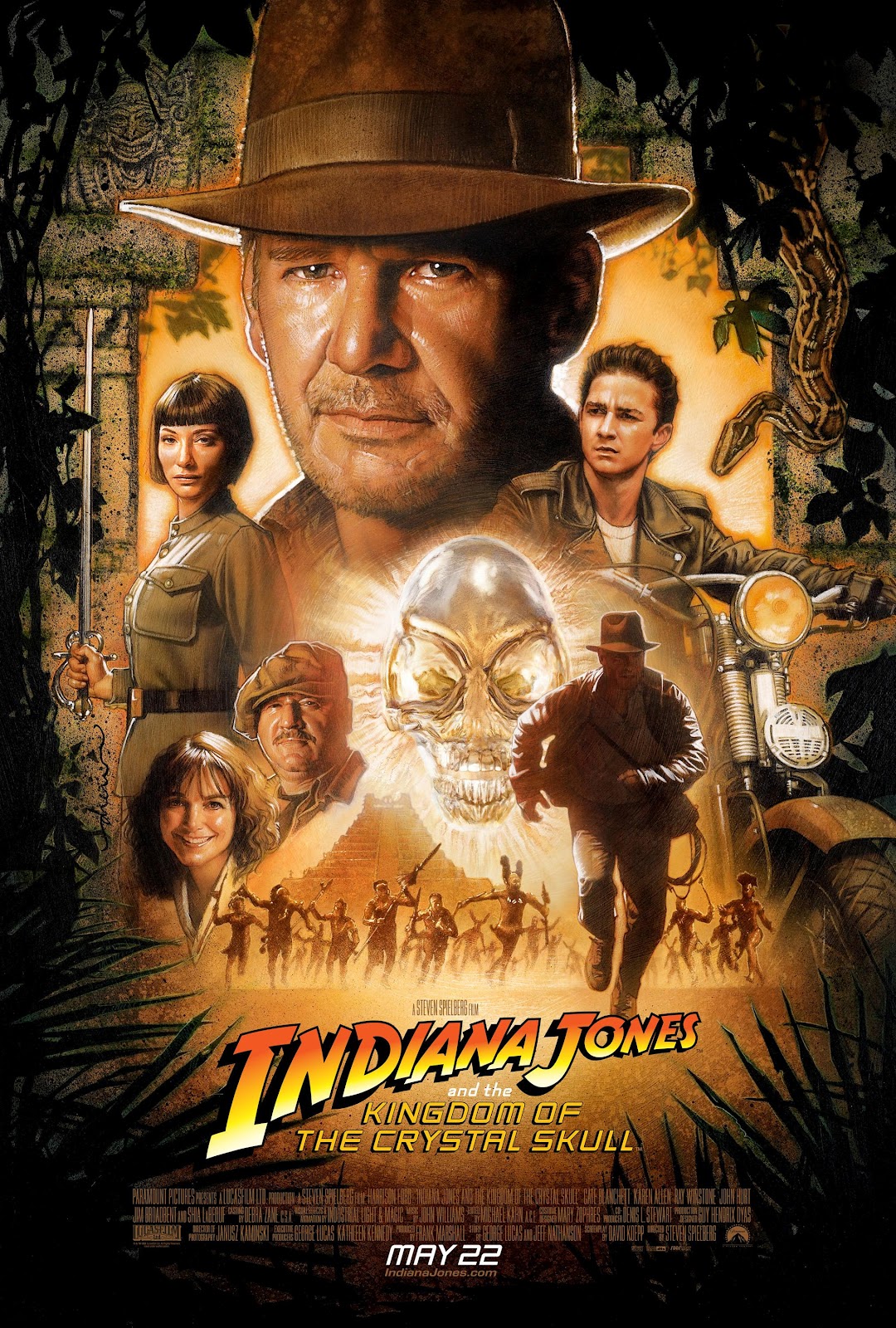
Indiana Jones and the Kingdom of the Crystal Skull. (on DVD)
So I finally got around to the last movie in my Indiana Jones re-viewing. This is not so bad really. Not nearly as bad as I whinged and moaned and lamented upon seeing it in the cinema. Yes, there's some stupidity, and a lot more useless stuff than I'm used to in IJ movies, but for some reason I was able to forgive it more this time. 
The sci-fi angle (aliens, telepathy) was really grating on initial viewing, but it seems quite appropriate for the time period now, as does the swapping of Nazis for Reds as the cookie cutter bad guys with machine guns. 
Indy really seemed in character for most of his screen time, which was nice to see, like an old friend returning. I really liked his briefly outlined history since Indiana Jones and the Last Crusade – being a spy, helping the US government, etc. That, and his ability to really endure a lot of physical punishment, made him extremely reminiscent to me of Will Eisner's original comic book version of The Spirit, post World War II. 
LaBeouf had obviously been studying Ford's acting from the first three IJ movies and was aping that the best he could a lot of the time. He was a lot easier to ignore on this viewing too — he wasn't so annoying. Allen's acting was pretty woeful and vacuous though. The ongoing inclusion of the Mac character was completely perplexing once he had "admitted" to being a double agent — superfluous, confusing and should've been eaten by the ants. There were only a few times computer generated imagery was over used. To be honest, Lucas and Spielberg could be admired for their restraint there. 
Here's an observation apropos of nothing really… The opening scene with the kids in the hot rod near the nuclear bomb test site reminded me very much of the opening scene of The Hulk's origin story from the original comics. And then to see a general named General Ross turn up? Coincidence or homage? 
Lastly, I never had a problem with the fridge. Not originally, and not now. There, I said it. 

23 August, 2012

GP TV. Ep03.

And so we come to the first time the Greener Pastures' creators themselves were ever on television. The funny thing is, it wasn't on Australian TV! 

Michael and I thought we'd go to New Zealand, just for the heck of it, to visit their annual comic convention at the time: IcoNZ. It was July 1995 and this was their second of three IcoNZs. We weren't the only Aussies there either, Stuart Hale also made the trip representing Issue One Comics . 

One of my favourite sales techniques when interested punters asked if we were New Zealanders was to say "Yep! We're from the West Island!" which would usually take a moment, and a double-take, for the penny to drop. At one point I looked up to see Neil (Split Enz, Crowded House) Finn browsing through our work. He bought a copy of Greener Pastures and as he walked away I sheepishly said "You can write a song about it if you like…" I don't think he ever did. 

We had a great time and met some lovely people. 

I don't know exactly what television show this report appeared on, I assume it's the news or a magazine style show. Neither do I know exactly what night, but I assume it would be 1st or 2nd of July 1995, as that was the date of IcoNZ 2. After the inane chatter about trading cards, sporting memorabilia, and the fake Baywatch girl, they talk to some local NZ comic creators and Michael and me. 


Cartoonists interviewed: 
Craig Petersen 
Wade Shotter
Cornelius Stone
Tim McEwen
Stuart Hale
Michael Michalandos

Cartoonists work also shown: 
Matt Hatton
Ant Larcombe
Ant Sang
Sam Young
Paul Newell
Jason Paulos
There are also a few incidences where there is work that I'm not able to easily identify. My apologies. I am pretty sure there's a flash of Roger Langridge though.

Aired July 1995. 

20 August, 2012

What I Read Last Month…

This is what I read in… 
February 2012


Phatsville #16, by various.

The latest issue (at the time) from these amazing stalwarts of Australian underground comics (if such a thing really exists anymore). If you're familiar with Phatsville, then you know what to expect, and you're in for more of the A-Grade same. If you're not familiar, let me tell you you're in for a healthy dose of ugly, smelly sex & drugs & poo & dicks, all with a cheeky Aussie wink. 
This issue leans heavily on the two longest contributing citizens of Phatsville, John Stewart and Giles Kilham, which is great, and their true-life adventures in America when they attended San Diego Comic Con, which are really funny. J-Stew and G-Man are truly the spirit of this book, and it's definitely them and their cartooning and writing that I'm thinking of when I say 'Australian underground comics'. 


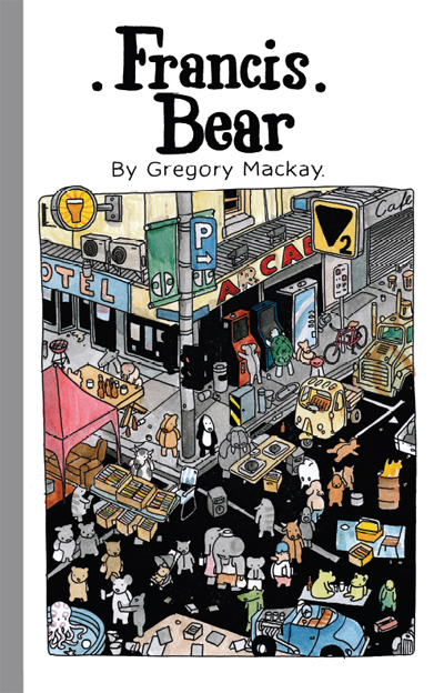
Francis Bear, by Gregory MacKay.

This is a, dare I say it, whimsical collection of stories starring the titular bear. I hesitate with 'whimsical' really because it shortchanges the heavier, grounded base of most of the book. Despite it being populated with nothing but stuffed animals, this isn't a kids' book. Below that surface style, immediately below, are stories of urban living, cars with no brakes, skin cancer, petrol wars and getting drunk. I don't know that there's necessarily any important statements or observations being made, but the quirky vignettes are obviously drawn from life to some extent, and they're usually quite dryly funny. 
The cartooning style is composed entirely of a line of unwavering weight but always uncertain strength. This (not thin) monotone line only adds to the childrens' story look of the pages, in a Miffy kind of way, and the busy amount of detail in a Where's Wally? kind of way. That busy-ness is never cluttering or confusing though, which is a real skill in itself. 
A book really deserving its international publication. 


All You Bastards Can Go Jump Off a Bridge, by J. Marc Schmidt. 

I was honored by being asked to do an "author's quote", or whatever they're called, for this upcoming book by J Marc Schmidt to be published by Milk Shadow Books. They sent me a digital advance copy and this is what I gave as a quote: 
"Do you like the surreal in your comics? Do you like the non-sequitur? Do you like to see someone having fun over and over as they experiment with the comics medium? Then you'll love this." 
And that just about sums it up. Over 200 pages' worth of J Marc's simple, mono-line-weight cartooning, in which there's obvious improvement as the book goes on. It's not for the easily offended, there's nudity and sex and (oh no!) dangerous thinking in these mostly satirical pieces. 


The Soldier Legacy #s 2 and 3, by Paul Mason.

Paul Mason's quasi-super-hero comic feels like a quaint kind of throwback to a style of comic Marvel used to make in the 70s. 
The art style is an interesting pairing of a less realistic, more cartoony type of drawing than you might expect from the genre (super-heroic action, both urban and set in World War II), but it works a treat, I think mostly because it stops it from taking itself that little bit too seriously. It's certainly over-the-top in regards to dynamic action and figure posing, as it should be. Mason, the lone creator of the series, still has a little way to go to be 100% professional in ability, but not too far. As he stands now though, it's certainly not a deal-breaker at all. 
Quite the enjoyable genre read! 


Kinds of Blue, by various.

This is a fine 84 page anthology with great heart for a great cause. That cause being letting the reader have a bit of an insight into what it's like to be on the bad side of depression. 
KoB suffers a little of what I feared it might: contributions from artists who are not primarily comic book creators, but not nearly as badly as it might have. In fact I was happily quite impressed by the showing of most of these first-timers. The stories don't suffer from repetition either, which was a another fear of mine given that most of the stories are written by the driving force behind the project, Karen Beilhartz. The fact that there's such a diversity of art style helps in that regard too. 
It's a handsome package, well presented in full colour, and is worth your consideration. 


Clubhouse Comics #1, by various.

What a really fine publication of an Aussie kids anthology comic. Some fun short stories with really good art and lovely colouring. A really good range of differing styles of quality story and cartooning too. Hopefully a sign of more really good things to come from Monster Comics. By the way, full disclosure, I happily had a short story included here myself. 


Astonishing X-Men #43, by various. 

I read so little American super-hero work now, and even less in the monthly "floppy" format, but this issue of Astonishing X-Men was drawn by Australian David Yardin, who in my opinion doesn't draw nearly enough interiors, though is doing a fabulous job as a cover artist. He does a super job here too, both pencilling and inking in his realistic superhero style. 
This issue reminded me how much I do enjoy a good, short, self-contained super story. It was fun, direct, had plenty of character moments, used action as a backdrop to dialogue, intertwined new lore with old cannon, and had a nice serve of suitably ridiculous super-hijinks. Regardless of the fact that of the three heroes, one was a character I'd never met before, and one I barely knew, I never felt out of my depth or lost. And to be honest, I got the kind of buzz only a fanboy of my kind of vintage can get when I recognised that the villain was from a (favourite of mine) 80s Captain America comic. A fun, pop read. 


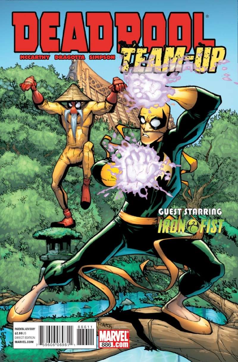
Deadpool Team-Up #886, by various. 

Another monthly floppy bought because of Australian content, this time: Perth writer Shane McCarthy. A throw back to the old time punch-'em-up team-up comics of my youth. Light on anything other than the action and snappy patter, which is par for the course with team-up books of this type, and doubly so for Deadpool I'm lead to believe. Fine fun.  


Deadpool #32, by various. 

One more time, an American superhero floppy bought only because of an Australian's contribution, this time Sheldon Vella. 
I enjoyed this so much that I wrote a complete a stand alone review which is available here


Come Inside My Body — A Choose Your Own Adventure 24 Hour Comic, by Rebecca Clements. 

And that title just about sums it up really! Except for how fun and silly it is, and how wonderfully and whimsically cartooned and written it is. Rebecca's a treasure, and dispite my usual dislike for the publication of 24 Hour Comic Challenge efforts this was a delight to read. 


Mongrel #1, by Bernard Caleo. 

The first issue of Bernard Caleo's new 12 issue project, where the serialisation and the delivery by post are as important, according to Bernard, as the pages themselves. 
It's short at only eight pages, but does the job for setting the scene for the coming story. 
The art is not slick, but it is full of thick brushy verve, with the real strength of Mongrel being in the dialogue, the characters, the philosophy and philosophising. We only get an inkling of all that in this first instalment but it's what I'm looking forward to the most for the rest of the run.  


Blade Kitten volume 1, by Steve Stamatiadis. 

A very smartly produced, 40 page collection of Steve Stamatiadis' web-then-print comic. Although it heavily draws from manga stylings, I don't think this could actually be classed as manga. The art is slick and accomplished, very bouncy and colourful, which completely matches the fun, tongue-in-cheek action/adventure story. 
Quite an enjoyable, poppy ride. 


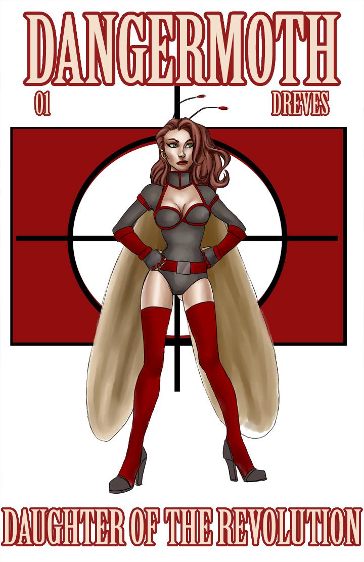
Dangermoth, by Noelle Dreves. 

I picked this up from the artist/writer at a recent Supanova because the art intrigued me. That and the fact it's a female protagonist by a female creator. 
The book's fun and bouncy in theme, style and execution, but still sits on the not quite professional side of the line and not just because of the sketchy style of it, which can be a professionally exercised decision. It's more a seeming lack of experience in the storytelling, slightly awkward figure posing, backgrounds, staging and lettering. The cartooning itself is fine, it's what attracted me in the first place, but application over the long(ish) haul of a complete issue of a comic is where such a thing is truly tested. 
As a first issue it's all set up and origin story, which I understand, but without something more intriguing in a longterm sense, simply presenting the hero's beginning may not have enough to pull me into the next issue. 


Transformers: The Art of Trevor Hutchison, by Trevor Hutchison.

A well deserved reprinting of Trev Hutch's striking and somewhat groundbreaking covers for IDW's Transformers comic All Hail Megatron. The comic was written by Shane McCarthy and he and Hutch are both Perth locals. 
The covers as reproduced here are a refreshing departure from what is normally seen on comic shop shelves, and it seems they draw inspiration from, and successfully evoke the feeling of, war posters and communist propaganda posters, while still being modern and original. 
A nice little collection. 


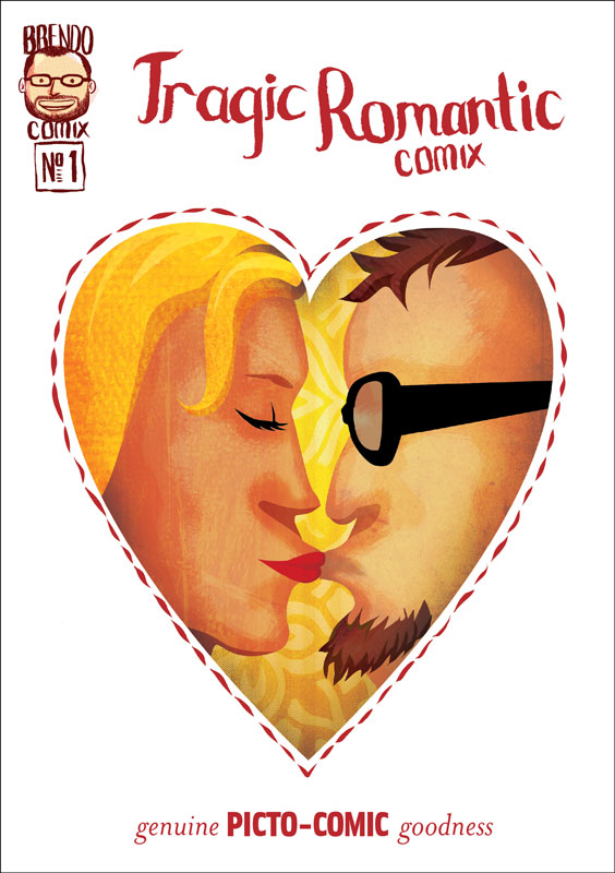
Tragic Romantic Comix, by Brendan Halyday. 

Short and oh-so-sweet romantic daydream by Brendan Halyday. A5 in size with most panels filling the whole page — sometimes the whole spread!, this has thick and jaunty brush work making up most of the art, and interestingly also infusing the lettering. 
A bitter sweet little burst of romance. 


Bad Guy, by various.

This is the first issue of what looks to be a comic attempting a high concept superhero story. 
There's some interesting, stylistic art that thankfully has some personality and that's not just trying to ape the latest Marvel/DC/Image style. Not that it doesn't owe anything to the early Image school of superheroics, but I think it's still trying to find it's feet, especially in layout and staging. 


Dirt Kernel #1, by various. 

Another not quite-professional-standard first ish here as well. Again, full of life and enthusiasm imparted from the team of creators, which if nothing else gives this tale of the only straight cop in a crooked big city police department something to enjoy. 
The art, firmly rooted in manga as style, needs more attention most obviously with the sparse, rushed backgrounds and the lack of originality in style.


Slightly Nervous, by Arran McKenna. 

Normally I'm a sequentials only kind of guy, but Arran McKenna's adorable A6 sketchbook of monsters, weirdoes, 'toons and doodles (in both meanings of the word) is too good not to tell you about. It's a fab collection that showcases quite a range of Azza's styles and subject. 
Grab it if you see it. 


Ben Lives in a Cabin Up a Mountain, Can You Still Get Pregnant If The Dude Just Cries The Whole Time, and It Got Big For No Reason, by Andrew Fulton. 

I received Andrew Fulton's latest three minis in the mail, and they're as wonderfully loopy as ever — loopy stories and loopy limbs. Expect full reviews. 

16 August, 2012

Review: In For The Krill #s 1 & 2.

In For The Krill #s 1 & 2. 
Jill Brett and Greg Holfeld. 
Panic Productions.  
inforthekrill.blogspot.com.au
www.panicproductions.com.au


This is a really fun and interesting comic. It centres around Max, a haiku writing emperor penguin who smells a rat. Killer whales are making deals with seals; sea life is turning up dead with strange canisters tied to their necks; penguins are being strangled before being eaten; the supply of fish has just run out; and no one's talking. A mystery is afoot, and Max is the only one who can see that it's all somehow related. 

In For The Krill is one of those good comics that just doesn't have enough pages. I got to the end of each issue before I realising it, wondering why it was so short, only to find that there was actually over 30 pages of story in each! There's two reasons for this: the style of the story-telling; and it's high quality. This high quality means that "time flies when you're having fun". 

The story-telling style is certainly never overly wordy, and often whole scenes – pages worth – are totally wordless. This makes time fly as well since it has a tendency to burn through pages, but it's the brave kind of "let the pictures tell the story" type of story telling that I like. There are plenty of silent "pause" panels, pregnant with acting and meaning, never wasted or useless, but always important steps in the playing of the scene. There's also many scenes of very good dialogue and witty, revealing interplay between characters. These do a great job of naturally presenting character, personality, motivation and the relationships not only between the characters but also to the whole setting and plot, while being entertaining in their own right along the way. 


In the first issue we're given large amounts of backstory and character history in very economical and enjoyable ways: some poetry, some action, some banter, some animosity. We learn that the main character is penguina-non-grata, has a penchant for haiku and conspiracy, and regardless of past indiscretions still seems to engender loyalty from at least one friend and a politically/socially powerful ex-girlfriend. That's an awful lot of character info delivered extraordinarily painlessly. 

There's a number of times where staging and exposition get downright and wonderfully surreal! There's a sense of theatre (stage and audience) in these particular passages, and a narrator-like soliloquy to their delivery. It's done boldly, with no hint of apology, and as such this reader happily accepts the conceit. I found it refreshing and very agreeable. 

The story employs that strange but wonderful type of anthropomorphism that puts the animal characters very much in their natural habitat but also builds in the trappings of human society. For example, they're definitely living on an arctic ice shelf, but they also have an art deco styled bar and night club with the societal customs that go along with it: bouncers, barmen, etc. 

I love the art. The character designs are solid, elegant, dashing and forceful, with plenty of scope for the type of rubbery faces and movement you might see in a Looney Tunes cartoon. Holfeld's animation experience shows in the fabulous character drawing and acting. His energetic drawing gives the characters wonderful exaggeration in physicality and expression that matches the story and cartoon exaggeration of the plot. And there's as much fluidity, stretch, malleability and intelligent design to each page and panel as there is to the drawing of the characters. We're often treated to some wonderfully classy and clever seamless scene transitions utilising the sweep of characters, action, and/or other shapes to do what might otherwise have been don with a wipe or dissolve if this were a moving picture. 

There's a solidity to the line, a concrete strength, even as it flows and bends and has life, which creates volume and weight to characters and environments. It looks like it may be a combination of dip pen and brushwork. There's a complete absence of cross hatching or feathering, with just enough actual linework curving around forms to give them interest, style and volume. Solid, weighty blacks anchor a lot of the panels and in turn, the figures within the panels. Unbroken expanses of white not only evoke the environmental setting but often are used for the sake of simplicity and clarity as well. 


It's a black and white comic and there's a large amount of skill being shown in the design and layout of the pages. The drawing often employs omissions of linework, leaving the indication and implication of solid form to the tapering off of contours or solid blacks or the judicial use of silhouettes. This is all in unison with the well employed use of black and white, in large doses and small, as positive or negative space, in detail or the complete lack of it: all adding up to interesting, purposeful, story driven drawing. 

Holfeld seems to have that uncanny ability to enable the words coming out of a characters mouths to immediately have a tone and accent, and not just because of the witty writing and dialogue from he and Brett, but also because each character design makes it so. Not easy when working with the seemingly invariable look of the Antarctic emperor penguin, but done delightfully throughout creating a unique look and voice for each of the principals as well as almost any incidental character that has a speaking part. 

The easiest way to get a hold of In For The Krill is probably via the Panic Productions website, and it's well worth the effort. I have read the first two issues, but I've just bought numbers three and four. I can only hope that forthcoming issues are created faster than these first four, but regardless, you do yourself a disservice if you don't pick these ones up.

25 May, 2012

What I Watched Last Month…

What I watched in… 
January 2012

Mission Impossible III. (via digital rental) 
I'm not sure what it was about this instalment of the M:I franchise but I didn't quite like it as much as I thought I would. I don't think it was quite as slick and finished as it wanted to be, or that I wanted it to be. Probably though it was just because it was a JJ Abrams written/directed piece and I was really hyped. 
Philip Seymour Hoffman and his character were nicely underplayed, both in acting and in the amount of screen time given. I think I'm suffering from Tom Cruise burn out though after sitting through three of these Mission: Impossible films, and he's starting to get on my nerves a little. (Normally I can take him fine.)
I was again annoyed that the gist of the plot is inextricably linked to Hunt's romantic relationship. I want an adventure and plot-impetus for its own sake! Yes I want to be invested in the characters' dilemma, but I want a more interesting reason than "they kidnapped my wife". Stupid idea to have him marry in the first place. I was kind of hoping for a James Bond-style death of the wife in the end to lend it some real credibility and gravity. 
In the end though, it was a good fun adventure action spy flick. Thankfully they put in a few M:I gimmicks & gadgets as well as some crazy situational capers. These turned up the tension regularly in the fun, spy-antics, Impossible Mission Force, style that they should. 
Unfortunately I could see through the plot's smokescreen and twist too early, and I also found the obvious McGuffin-ness of the mission's overt objective too overplayed for my liking. 
For the M:I franchise this was a strong, enjoyable return to updating the already great concept. 

Mission: Impossible 4 — Ghost Protocol. (at the movies) 
This was everything I so dearly hoped it would be as Brad Bird's first time as a live action director. Having already directed two of my favourite movies ever (which just happen to be animated), I so wanted Bird to succeed here just as well, and he has. For me, this is the best of the franchise, with fabulous, 'impossible' capers being pulled off with spy-gadget trickery, sheer wit, muscle, skill and/or determination. We're thrown from one high-tension, ticking-clock scenario to another with just enough time to catch our breath and get to know the protagonists a little better in between. Each of the heroes has enough depth and personality to make them enjoyable, believable and likeable. There's plenty of globe-trotting, chases, fights and daring-do, usually presented for good reason, clearly, and in fine, exciting style. 
This is a great action spy movie that is over the top in all the right places. 

The Adventures of Tintin. (at the movies)
My main gripe with this animated movie is the animation, which makes it a pretty big gripe. I think it all comes down to this: due to the push for realism – that is realistic models, movement, facial expressions, gestures, textures, etc. – I came away with the sense that it's 'overacted', and yet, because of it's supposed 'cartoon' nature, being an animated film, there is a definite lack of caricatured movement and caricatured acting. The realism and animation are fiercely at odds with each other, fighting for attention, neither getting the upper hand. As a result the film ends up sitting uncomfortably in its own skin. Of course there's the usual issues with uncanny valley, and I found a number of facial close-ups to appear a little too waxy in their appearance. In other aspects though, visually I found the movie quite lovely, if unremarkable. Again, because of the push towards realism, regardless of how well designed and created the backgrounds, props and costumes are they are mostly forgettable because they're so real. 
My other problem with this film is entirely personal and very annoying. Having only just recently read the books for the first time that the movie is based on I found myself constantly distracted by comparisons, wondering about decisions made to add, remove or mix plot threads, and second-guessing how the next point would play out. All my fault I'm afraid. I'll need another viewing to fully relax into the flow of the story. I think I'll have to wait for that second viewing before I'm entirely sure about story itself too, for much the same reasons. I will say though, by way of comparison with the books, the Thompson twins were sadly under-utilised for comedy relief, which they're very good at in print. I found it interesting, and a little revealing, at the successful attempts made at giving Tintin's personality a tad more depth than the books. From the little I've read, Tintin has terribly little depth, while in this movie the numerous references to his being a famous journalist, the showing off of newspaper clippings of past exploits, and his collection of typewriters, point to his having something more like a driving desire to seek out and run down a story or mystery. 
I could go on about the differences in approach of storytelling between this movie and the books it's based on, but that could be a very long essay in itself. 
There's some spectacular scenes, some amazing cinematography that really could only be achieved through this sort of computer generation, but in the end, this film adaption was technically well made, but lacked a real grip to engage me fully. 

Alien. (on DVD)
This is one of my favourite movies. I love the suspense and tension which is maddeningly high from the very first frame. I love the look, design, cinematography, acting, all of it. I love the time taken to get you in the mood when necessary. I love how loud it is. And I don't think there's really anything much that I don't like about it. 
This is probably the third, maybe the fourth time I've seen it. I was lucky enough to watch an original print in a cinema about two years ago, and the experience was a lot different to this time where I watched it on DVD with my family. For some reason it felt like a lot of the tension was lost through this delivery medium. I explained the genre to my daughter as more horror than sci-fi. She was adamant it wasn't scary enough to be a horror movie. 

I also saw two live performances of storytelling last month… 

Annie (on stage, at The Lyric Theatre, The Star, Sydney), which was a nice enough production, though in the end quite unremarkable and not at all different enough to the last Sydney production in 2000 to warrant seeing it again (to the point that the programme used a lot of photos from that production and not this one!).
Circus Oz (in a tent, Tumberlong Park, Darling Harbour, Sydney), which was an amazing night of old fashioned circus dressed up in new-fangled steampunk. Brilliant design, look and feel, great skill and showmanship, fabulous music (I'm buying the soundtrack), and an enormously entertaining and fun night. Circus Oz is always worth experiencing. 

21 May, 2012

Minotaur!

Here's a picture I drew a few months ago for one of the OzComics Weekly Drawing Challenges. The theme was mythology and I had some time on my hands so of course I drew a minotaur. I hasten to add that this is NOT Trevor, nor is it based on a scene from he up-coming Greener Pastures graphic novel, but maybe it's what Trevor might have been in another life or universe. 

One interesting aspect about this is that it was drawn entirely digitally, from the 'pencil' sketch all the way through to 'inks'. It's not a luxury I often get since I don't own a Wacom Cintiq (a pressure sensitive screen that can be drawn directly onto/into) and I find too much of a disconnect between the screen and a normal digitising tablet. 

It was great fun to riff on Trevor with no restraints and no real end goal in mind other than making a really exciting and vicious looking minotaur. 

10 May, 2012

What I Read Last Month…

This is what I read in… 
January 2012

Star Wars: Invasion, volume 2: Rescues, by Tom Taylor and Colin Wilson. Dark Horse Comics. 
This is the second trade paperback from the team of Taylor & Wilson telling the tale of the Yuzhan Vong invasion of that galaxy long ago and far away. I'm no Star Wars fanatic, but even for me it's fun to see fondly remembered characters like Luke, Leia and Han have cameos. More importantly though, the cast of characters that I've never met before are engaging and likeable. 
It's a fun ride with enough twists and turns, revelations (both in plot and character), and action, that I'll happily be coming back for volume 3. 

The Adventures of Tintin — The Crab with the Golden Claws, by Hergé. 
I was particularly taken with the cartooning in this volume of Tintin's adventures, especially the faces, and Tintin's the most. For something so simply constructed, there's a wealth of expression there and a lot to find attractive. Numerous characters are delineated with lovely, clearly formed caricatures, and this is wonderful cartooning in that respect. It doesn't quite hold true across all racial depictions unfortunately, with what looks to me as a more clumsy approach to Middle Eastern and Asian characters. 
There are some wonderfully funny bits in the opening scenes, which can be very difficult to do in comics. The fun continues throughout with the drunken shenanigans of the obviously alcoholic Captain Haddock, who is introduced nicely for the first time in this story. If I were Tintin though I would quite happily have never seen him again after the way he acquits himself during their time together! I'm not sure how they ever became such great friends. 
For some reason this adventure of Tintin didn't grab me. Despite the exotic locations, fun action, tight scrapes and adventure, and I'm not sure why. Perhaps there wasn't enough rise and fall in the tension. Maybe the stakes didn't seem high enough. It might've been that Tintin himself was taking it all too much as 'business as usual'. At any rate I wasn't as interested in coming along for the ride or seeing where it took me this time, despite everything else this book had going for it. 

Celadore, by Caanan Grall.
This is a really fun book and a really great ride. From my experience fun is what Caanan does best. That and the voice of children, and children make up a large percentage of the cast of this 192 page book. 
Celadore is named after the pivotal protagonist of the three stories collected here. All three of which are fabulous, with plenty of real danger and sacrifice for the characters mixed in with jaunty dialogue, believable, emotional relationships, and fun action. There's never a status quo, not within each of the stories, and not from one story to the next, which I really appreciated. It gives a more palpable tension and believability to the dangers faced by the cast knowing that things will indeed be different by the end.  
And what a great cast. Quite large, very interesting, always introduced and used purposefully. It grows naturally and well, until it's quite an ensemble. The central members are so great that it's hard to say that Celadore is even the "main" character, even though the book bares her name. Again, great evidence of good character writing making me care about them all so much. 
There's a great concept that ignites this book, but even better than that is the fact that Caanan doesn't rest on it, but evolves from it and builds on it in what really is quite an exciting and believable manner. It kept me as a reader on my toes and keenly interested. 
I love Caanan's cartooning style too. It's deceptively simple, full of life and bounce, and he has a great handle on character poses and expression. The character acting is really good. 
Unfortunately there are a couple of issues with this volume, the biggest of which being the printing. It's dark and muddy, and for a story that often takes place at night or in other gloomy settings, this is unforgivable and very disappointing. It's way too often out of register as well. 
They are the technical issues. Regrettably there's one creative issue as well. Far too many times I was confused and lost by the storytelling. This is a fabulous rollicking set of stories and I just wanted to go with them, but I was too often hampered by having to reread pages, trying to figure out what I had missed and why I'm confused. I even reread the first half of the first story in an effort to "get in the groove" of the storytelling style, assuming I just wasn't hearing the book's voice correctly, but in the end I think Caanan simply didn't always allow the rungs in the monkey-bars to be close enough together for me. 
This is a sad stain on an otherwise brilliant trio of stories. I would love to hear more from Celadore and her friends in the future if Caanan could swing it. 

06 May, 2012

Supanova Gold Coast 2012

After writing about Supanova Melbourne the other week, how could I not write about the weekend that followed on the Gold Coast? 

This was Supanova's inaugural Gold Coast expo, and it went off with a blast. For me, it felt like one of, if not the best expo we've ever put on, in so many ways. It had a fabulous buzz and the Gold Coast really embraced SN with everything it's got. Great vibe, great guests, awesome crowd, fab venue, amazing team. Solid gold.

Full disclosure: I'm one of the founders of Supanova, I art directed it for about six years (jumping on board that title again as of this week), and have a financial stake in the business. 


Before the show even opened Belle was getting into the Supanova spirit during a quick visit to a local toy shop. Did somebody say "Assemble?!?"

Supanova started with a great ComicBook MasterClass on Friday night, lead by the very popular Brian Michael Bendis


The crowds waiting to get in on Saturday morning were great!

Which translated to a fabulous bunch of excited people inside!
 The crowd in one of the Artist's Alleys.

 And in another of the Alleys. 

 Heading towards the main autograph area. 

And on the main trading floor at the complete opposite end of the expo. 
Can you spot: a) a storm trooper; b) a Fin the Human hat, and; c) Fel, of Supanova Guest Services?

 Kings Comics hosted our comic book guests Brian Michael Bendis, Carlos Pacheco and Tristan Jones. Each of whom did a wonderful drawing in my sketchbook. 

Here's Brian doing his sketch in my book. 

We did a great live cross to LA to speak to Marvel's The Avengers' Agent Coulson, Clark Gregg. At one point Jaimie Alexander (Thor's Sif) gatecrashed the panel to prank Clark.  

Speaking of Sif… here's the real life action figure herself! 


Here's a couple more shots of Artists' Alley. Spread out along here in the two photos you might be able to see Stewart McKenny, Travis Burch, Christopher Sequeira, Cameron Davis, Paul Abstruse, Wayne Nichols, Samuel David, Jeffrey 'Chamba' Cruz, and Leonard Bermingham

Belle sat in on Artists' Alley too, selling her handmade wallets, each made from actual pages of comic books, each one unique. 

And speaking of comics and my offspring, here's The Boy (on the right) breathing in the smell of good old eighties Uncanny X-Men. On the left being Chris Rattray, the pusher in this case, one of Supanova's marvellous MCs. 

We had a very swish cocktail/VIP party on the Saturday night. Here I am, being very swish myself.

What a great venue! See you next year Gold Coast!