Showing posts with label art. Show all posts

02 March, 2013

Current work: Liedekijn

I'm working on two non-Greener Pastures comics projects right now, one of which is a group gallery exhibition opening soon in Canberra. The interesting thing about the exhibition is that each piece of art involved is a single page in a narrative that makes up a complete story, The Song of Heer Halewijn

The show is called Liedekijn and it has been organised by the seemingly indefatigable Emma-Jean Stewart. The story is a medieval Dutch/Flemish fairytale originally written in a poem. The translated poem was split into 23 plot points and those points were handed to the artists to illustrate. Some pages, like mine, are in the traditional comic book format of sequential panels, while others are single illustrations. Each page progresses the tale though, the tale of Machteld and Halewijn, a tale of seduction and murder. 

There's a full colour art book to go along with the exhibition so that the story can be read once the show is over. 

It's a very interesting project to be a part of and I'm really excited to be going to the opening night. Feel free to join us there on Thursday the 28th of March. Many of the artists will be in attendance. Details below. 

By way of cajoling you into either viewing the exhibition or ordering the book, I present the pencils for my page below. My page appears about halfway through the story as Machteld and Halewijn meet for the first time. To see my finished inks, and to find out what happens next, you'll have to get the book. With a pre-order price of only $12 it's a steal!

Here are the details: 
Venue: The Front Gallery. Shop 3, 1 Wattle Place, Lyneham, ACT.
Dates: 26th March - 8th April, 2013. Opening night: 7:30pm, 28th March 2013.
Exhibition website: liedekijn.com
Gallery website: www.frontgallerycafe.com
Opening night Facebook event page: www.facebook.com/events/389157271170276
Order the book: emmajeans.bigcartel.com/product/liedekijn-artbook-preorder


13 February, 2013

Review: The New Teen Titans: The Judas Contract


The New Teen Titans: The Judas Contract 
(Reprinting: The New Teen Titans (volume 1) #39 and #40, and Tales of the Teen Titans #41-44 and Annual #3. 1983.) 
By Marv Wolfman and George Pérez, et al. 
Published by DC Comics.  
www.dccomics.com/graphic-novels/the-new-teen-titans-the-judas-contract

I read this trade paperback in preparation for the visit to Supanova once of the Wolfman/Pérez superhero comic book dream team and wrote this review at the time. The book is quite an interesting read.

I say that it's an interesting read for a number of reasons, and not the least of which is the over-arcing plot of a spy in the Titans' midst, which begins as a subplot and eventually takes centre stage. Wolfman goes to some lengths in the introduction to this reprint of DC Comic' The New Teen Titans from 1983 and '84 to make sure that the difference between "spy" and "traitor" is clear. The character in question is Terra – she's a recent recruit to the team but is actually embedded as a spy from the very beginning. She is not someone who at some point turns bad and betrays her friends; no, she was never a good guy, her plan was always, in league with a longtime Titans villain Deathstroke the Terminator, to kill the Titans. Interestingly, the reader is never in doubt of that — it's never kept as a secret from us, as we are witness to all the behind the scenes machinations of this plot. That being said, there were numerous times throughout where I wondered if Terra would betray her partner Deathstroke. She's very nicely and subtly written in that regard, but it also plays on this reader's assumption/hope that everything might turn out OK in the end and that she'd see the error of her ways.

The other point of note regarding the character of Terra is that she's only 15 years old. That's not such a big surprise for a book called The New Teen Titans, except for the fact that she's very much portrayed as overtly sexual — an upping of the ante for her character that was always played as somewhat streetwise and canny. In one scene she wears a mostly open nightgown with nothing underneath, with the inference being that she has just had sex with Deathstroke (who must be in his 40s or 50s, maybe older). The inference is later confirmed as she refers to the two of them as lovers. Statutory rape anyone? Perhaps this is a tad blasé in 2013, but in 1983 this was pretty hardcore. As far as Deathstroke is concerned, there are times when it seems that he is being presented in a somewhat sympathetic light, a villain with a sense of honour, but his relationship with Terra blows that away completely. Additionally, Terra smokes and drinks openly on page. Also not such a big deal now I suppose, but pretty surprising in the mid 80s I would assume, especially in what I think was a Comics Code Authority approved book. She's a surprising character and I don't think Wolfman and Pérez at any point try to make her sympathetic. They went hard with her and it really pays off dramatically in this story.

This arc was originally published during the period when the title The New Teen Titans was transitioning to a higher quality publishing format and beginning with a new #1. The original series was retitled Tales of The Teen Titans and for a year there were two monthly books starring the same characters in separate stories. The reason I bring this up is because I wonder if that's the reason for the unusual pacing, chapter to chapter, that I found throughout. It really seems like Wolfman and Pérez took the opportunity to let their story-telling breathe much more than usual through the middle section. There are two chapters (originally individual monthly issues) with very little in the way of superhero action and slugfests, or even characters in costume for that matter. Instead we're treated to civilian Dick Grayson tracking down missing Titans, and then an extended account of the origin of Deathstroke, which takes up nearly an entire chapter on its own. None of which I complain about as most Wolfman/Pérez Teen Titans stories have a fair share of action and mayhem, so over the course of the whole volume there's certainly enough of that to satisfy. This slower section of the story also culminates with one of the major outcomes of the book: Dick Grayson, who has retired from the role of Robin (as Batman's first kid sidekick) in the first chapter of the book, takes on the new name and costume of Nightwing by the end of this chapter.

It's funny though, by the end of the story, there are so many people who know The Teen Titans' secret identities, from major villains and supporting cast to hoards of lackeys and goons, that Bruce Wayne's life would surely be a nightmare! Conveniently ignored I guess. The Teen Titans' world is treated like a closed system/universe a lot of the time I think – ignoring the rest of the DCU – and it's for the best. It not only makes things easier to write and to tell the story, it also removes one of the superhero genre's sillier tropes while making the story so much more interesting and engaging because of it.

Wolfman's dialogue and characterisation are very enjoyable to read, as he gives each of them unique traits and speech patterns, so that most of them are recognisable from dialogue alone. As far as superhero stories go he really made this feel like these were real people's personalities, real people who have amazing lives to lead. At no point are you lost or confused due to the high number of characters, and with 12 prominent characters in the course of this story, plus numerous supporting cast, it's no mean feat that Wolfman has pulled off.

Lastly, and again in a very unobtrusive manner, Wolfman easily avoids constant re-tellings of previous chapters' (or issues') events, which is often a problem with trade paperbacks that reprint stories originally presented as monthly issues. Exposition is deftly mixed into the telling of the tale here or smartly kept to a discreet minimum.

George Pérez is one of my all-time favourite comics artists, so I'll say that up front. As always, I enjoyed his art greatly; no one is as dynamic in page design, layout in-panel, figure posing, over the top action and general superhero shenanigans. His time on The New Teen Titans was where Pérez began to truly finesse his style though, particularly in his efforts to portray the individual look and personality of each character, and it's evident here in spades. There's subtle differences in every aspect of each hero: facial features, bone structure, body language, body shape, etc. — no cookie-cutter stock superhero drawings here. Sometimes he may seem to cram too much detail, too many panels, onto a page, but in almost all cases he is able to not only keep it readable but also appealing and exciting. Amazing how he's able to lay so many panels onto a page and still not make it look crowded.  

That being said, beyond the finessing of his character work, there's not much that's groundbreaking in Pérez's work here. The closest thing is the opening chapter, which he inks himself, and due to that self-inking it's very finely rendered. I'm sure most of the detail must have been a smudgy mess when originally printed on newsprint, but here it looks marvellous.

I couldn't write about this collection without bringing up Pérez's "distinct" sense of costume design. Here we are presented with quite a number of characters whose looks were designed by Pérez, the Brother Blood and Deathstroke villains among them, but the introduction of Jericho's (a new character) and Nightwing's new costumes in one page is one heck of a page! Nightwing's original costume as presented here can really only be drawn with a straight face by Pérez himself, and it's been toned down and simplified through a number of iterations since it's debut and probably rightly so. Jericho's costume though turns that up to 11, with puffy sleeves, scale mail vest, blonde-fro hair and muttonchops! Jericho's an interesting character, introduced here as part of the Deathstroke origin. He's an attempt to put a quiet personality and less overtly physical superpower into the superhero melée, so I can see the thinking behind some of the design decisions. They're both incredibly Pérez though, no doubt about it.

Another thing I found interesting in this collection is that there's four different inkers, including Pérez himself. As a process junkie, the assembly line method of most mainstream superhero comics holds quite a fascination for me, so to see various inkers over Pérez' pencils in a single volume interests me a great deal. Romeo Tanghal does a couple of chapters, which is no big deal since he had been the regular inker on the title since the first issue, and to be honest, I think quite a miss-match to Pérez's style. Mike DeCarlo also did a chapter, and I've never really been a fan of his kind of scratchy style, but I think he did quite well here, being able to handle Pérez's detailed pencils pretty well. The most enjoyable though was to see veteran Dick Giordano work over Pérez. Giordano has a mostly brushy, quite polished style of inking and he's an accomplished penciller in his own right as well, so he really knows what he's doing. He meshed very well with Pérez's pencils, softening them in an appealing way while not losing the distinctive Pérez style, acting or detail. In my opinion I would say that Giordano was probably working from layouts rather than finishes pencils for a lot of the Deathstroke origin chapter. I think it's the only time I've seen this combination of people and I very much appreciated it.

One of the most memorable things about the Wolfman/Pérez era of The New Teen Titans, and a long illustrious era it is, is that it's filled with human personalities and relationships, real heart and great emotional content. The Judas Contract may be the highest point of that and it's a brilliant read because of it. As slightly old-school superhero action, this is greatly enjoyable too. High on emotion, solid in storytelling, this collection is well worth reading.

05 January, 2013

Review: The Littel Dragun.

The Littel Dragun. 
Chris Downes. 
Self-published, 2010, 20pp, A6. 
www.sirwdchosen.blogspot.com  


With mini-comics currently appearing in my mail box from the latest incarnation of The Mini Comic of the Month Club, it seemed appropriate that I post up this review from one of the minis I got from it's initial iteration. The Mini Comic of the Month Club was a simple and brilliant idea from Australian comics and zine maker Pat Grant (original pitch here). (Caveat: Maybe it wasn't his idea, maybe he appropriated the idea. Regardless…) Basically, I joined the club for $20, and then received a mini comic in the mail every month for 12 months. (Or that was the plan anyway.) There was a limit to the number of members (50 I think, including the 12 contributors), which added an alluring tinge of exclusivity to the whole deal. The fact that the mini is delivered in the mail each and every month adds a lovely sense of anticipation too, waiting for an exciting little comic book jewel that could arrive at any time. Andrew Fulton has resurrected the idea and the gems are currently arriving ever four weeks or so now. If you see this being offered again (maybe at the end of the year, or next year) jump on it. 

The first mini that I received was by Chris Downes titled The Littel Dragun. (The misspelling is intentional, cute, and persistent throughout the equally cute mini comic.) Downes is an amazingly talented illustrator from Tennessee, USA, now residing in Tasmania. I feel a little mean reviewing this mini because I don't think there's any other way to get it except at the time through The Mini Comic of the Month Club, so I'll be brief but glowing in the hope that you'll track down other things that Downes might do in the future. 


From the personalised title page all the way through to the hilarious ending, this is indeed a little gem. Quick, witty, cute, surprising, and charming. I tend to feel that it may have been quite quickly created, but there's no complaints about that, as that's probably an important factor in the writing of it. The cartoony art has a chunky, rushed line, a brevity of detail, only depicting what's necessary, and a cute style that plays directly into the faux-storybook plot and telling. Using a landscape A6 format, Downes has a maximum of three panels on a page, but prefers to stick to just one. As such you would think the story moves very quickly through the 16 pages, but due to the captivating nature of the drawings and the great acting, you can't help but slow down to take it all in. That is, until the final few pages which really fly by, appropriately, to the hilarious crashing halt. A very well crafted tryst.

The aforementioned title page is but one small part of the greatly appreciated attention to detail and design for this — good lettering that is story-supportive, nice "end-papers", design elements like an ex libris page and corner frames on the front and back covers, etc. 

So as a reader hopefully now interested in picking up a copy of this comic that's not available to you, I do suggest that you get along to Downes' blog, where he currently mostly posts his editorial cartooning, and see what other comics he may have there for you to enjoy. 

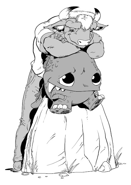
Above: Trevor and the Littel Dragun. I did this totally digitally on a Wacom DTF-720 digitising screen. 

16 August, 2012

Review: In For The Krill #s 1 & 2.

In For The Krill #s 1 & 2. 
Jill Brett and Greg Holfeld. 
Panic Productions.  
inforthekrill.blogspot.com.au
www.panicproductions.com.au


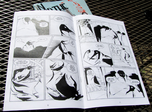
This is a really fun and interesting comic. It centres around Max, a haiku writing emperor penguin who smells a rat. Killer whales are making deals with seals; sea life is turning up dead with strange canisters tied to their necks; penguins are being strangled before being eaten; the supply of fish has just run out; and no one's talking. A mystery is afoot, and Max is the only one who can see that it's all somehow related. 

In For The Krill is one of those good comics that just doesn't have enough pages. I got to the end of each issue before I realising it, wondering why it was so short, only to find that there was actually over 30 pages of story in each! There's two reasons for this: the style of the story-telling; and it's high quality. This high quality means that "time flies when you're having fun". 

The story-telling style is certainly never overly wordy, and often whole scenes – pages worth – are totally wordless. This makes time fly as well since it has a tendency to burn through pages, but it's the brave kind of "let the pictures tell the story" type of story telling that I like. There are plenty of silent "pause" panels, pregnant with acting and meaning, never wasted or useless, but always important steps in the playing of the scene. There's also many scenes of very good dialogue and witty, revealing interplay between characters. These do a great job of naturally presenting character, personality, motivation and the relationships not only between the characters but also to the whole setting and plot, while being entertaining in their own right along the way. 


In the first issue we're given large amounts of backstory and character history in very economical and enjoyable ways: some poetry, some action, some banter, some animosity. We learn that the main character is penguina-non-grata, has a penchant for haiku and conspiracy, and regardless of past indiscretions still seems to engender loyalty from at least one friend and a politically/socially powerful ex-girlfriend. That's an awful lot of character info delivered extraordinarily painlessly. 

There's a number of times where staging and exposition get downright and wonderfully surreal! There's a sense of theatre (stage and audience) in these particular passages, and a narrator-like soliloquy to their delivery. It's done boldly, with no hint of apology, and as such this reader happily accepts the conceit. I found it refreshing and very agreeable. 

The story employs that strange but wonderful type of anthropomorphism that puts the animal characters very much in their natural habitat but also builds in the trappings of human society. For example, they're definitely living on an arctic ice shelf, but they also have an art deco styled bar and night club with the societal customs that go along with it: bouncers, barmen, etc. 

I love the art. The character designs are solid, elegant, dashing and forceful, with plenty of scope for the type of rubbery faces and movement you might see in a Looney Tunes cartoon. Holfeld's animation experience shows in the fabulous character drawing and acting. His energetic drawing gives the characters wonderful exaggeration in physicality and expression that matches the story and cartoon exaggeration of the plot. And there's as much fluidity, stretch, malleability and intelligent design to each page and panel as there is to the drawing of the characters. We're often treated to some wonderfully classy and clever seamless scene transitions utilising the sweep of characters, action, and/or other shapes to do what might otherwise have been don with a wipe or dissolve if this were a moving picture. 

There's a solidity to the line, a concrete strength, even as it flows and bends and has life, which creates volume and weight to characters and environments. It looks like it may be a combination of dip pen and brushwork. There's a complete absence of cross hatching or feathering, with just enough actual linework curving around forms to give them interest, style and volume. Solid, weighty blacks anchor a lot of the panels and in turn, the figures within the panels. Unbroken expanses of white not only evoke the environmental setting but often are used for the sake of simplicity and clarity as well. 


It's a black and white comic and there's a large amount of skill being shown in the design and layout of the pages. The drawing often employs omissions of linework, leaving the indication and implication of solid form to the tapering off of contours or solid blacks or the judicial use of silhouettes. This is all in unison with the well employed use of black and white, in large doses and small, as positive or negative space, in detail or the complete lack of it: all adding up to interesting, purposeful, story driven drawing. 

Holfeld seems to have that uncanny ability to enable the words coming out of a characters mouths to immediately have a tone and accent, and not just because of the witty writing and dialogue from he and Brett, but also because each character design makes it so. Not easy when working with the seemingly invariable look of the Antarctic emperor penguin, but done delightfully throughout creating a unique look and voice for each of the principals as well as almost any incidental character that has a speaking part. 

The easiest way to get a hold of In For The Krill is probably via the Panic Productions website, and it's well worth the effort. I have read the first two issues, but I've just bought numbers three and four. I can only hope that forthcoming issues are created faster than these first four, but regardless, you do yourself a disservice if you don't pick these ones up.

18 March, 2012

Review: Lumpen #8

Lumpen #8.
By Pat Grant.
Published by Pat Grant.

"Lumpen" is the name Pat Grant gave to his ongoing series of zines and comics, of which this is #8. I assume most of them were available where you would normally buy zines and the like, but this particular edition was only available through another of Grant's brainchilds; The Mini Comic of the Month Club — a limited edition subscription to a different creator's mini-comic every month for a year during 2010. (http://www.patgrantart.com/mcotm/page.html)

As might be expected from a true zinester, this has a real hand-made quality to it, from the pages that were obviously hand trimmed, to the silk-screened cardboard covers that look like they may even be left over off-cuts from previous projects.

The story is witty and whimsical, with a tinge of Dr. Seuss. Is it a commentary on the west's obsession with ownership, especially of land? Is it a commentary on the fleetness and ultimate futility of life? Or perhaps it's simply a humourous story, making a few wry observations about growing up and growing old. Regardless, it's well crafted and well told.

The artwork is very simple — really only stick figures — but the characters are imbued with amazing life and expression. To do any more with the art, to be more elaborate or ornate, would only detract from the "silent movie", pantomime feel of it all which is not only charming, but also helps make a potent distillation of the character's journey over the 20 pages. This style of cartooning, and of course the addition of a top hat, gives it an almost timeless feel.

The format is A6, and being reasonably there's a lot of whole-page panels. These are never used lazily however, always appropriately in service of the story. There are also numerous pages where multiple panels per page are used as required by the pacing needed for the storytelling.

It's a quaint little gem of a comic (although Grant calls it a zine, even though I think it's obviously a comic) and even though you couldn't get it except through The Mini Comic of the Month Club, Grant has made a number of other brilliant little zines and comics. Of course he currently has a magnum opus on the stands called Blue which I'll no doubt review sooner or later. Get along to his website and see what takes your fancy.

05 March, 2012

All hail…

Another of the character studies I'm doing. Again, this is one of the returning characters from the old Greener Pastures series, this time Caesar. I think I got exactly what I wanted in the sitting pose and expression, but I have a feeling I'll be redrawing the larger head portrait. It's not exactly right. I'll do some small, exploratory drawings of his head and face and then have another crack at this.

04 February, 2012

The all new, old, older Colin…

An A3 character study.

Here's the first look at a slight redesign of one of the characters from the original Greener Pastures series. Why redesign him? Various reasons, but mainly two – in this new story he's matured, as in he's a little older than he was in the original series, and also I'm hoping my drawing skills may have matured a little as well.

What you see here are the pencils for the study. I'll be inking it sooner or later. I'll show you that when it's done.

17 January, 2012

More on Theseus…

The last character study I posted here was of Theseus, who I said was a new character being introduced in Greener Pastures: The End. That's really only half true, as a fellow by the name of Theseus was the main character in Greener Pastures #7.5, and this is may be him again, or may be another aspect of him. Or maybe it's not him at all. It's hard to tell really. Our 'new' Theseus is certainly derived from the one that appeared in #7.5, at least visually, and perhaps thematically as well.


Anyway, here are a couple more Theseus sketches that I've done relating to GP:TE. They were done on a whiteboard and photographed as I was toying with some clothing design.

04 January, 2012

Character study…

An A3 character study.

I really enjoyed pencilling this character study of another of the new characters for Greener Pastures: The End. I was lucky enough to have a sleeping, leather jacket wearing life model on the bus the evening prior during my regular commute sketching session (see here), and that really helped in rendering this fellow's jacket.

08 August, 2011

More Noah…

Here's a few more sketches of Noah that I did much earlier than the character study I've already posted.

I drew the the very first one (below) before Michael had even given me a physical description of the character, and as has happened a couple of times with Michael and I, when he did finally describe him to me, I told him I'd already drawn him like that. Exactly.


14 June, 2011

Noah…


Finally! Some actual art on my blog!

I've been doing some character studies of both new and old characters for the upcoming story. Noah is one of the new characters. Here's the pencils for his A3 study, which I'll be inking when the mood takes me. Till then I'll continue to pencil more studies.